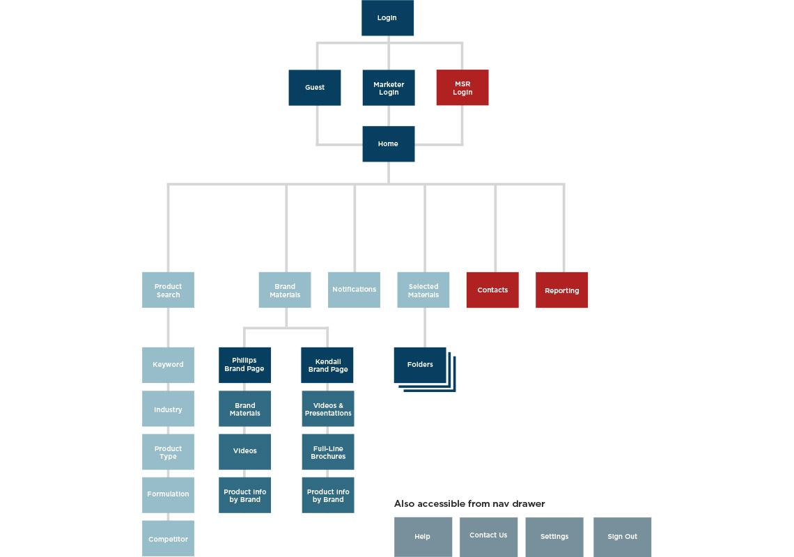
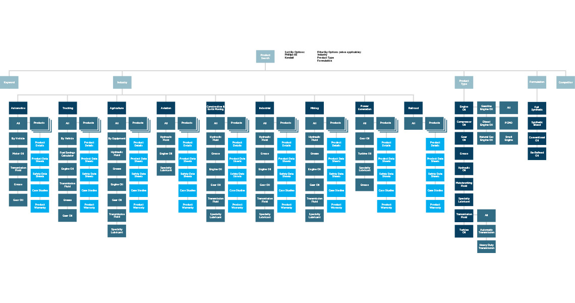
Screen Flows
We conducted stakeholder interviews and user research based on an early prototype. After using the findings to establish user goals, we dove into UX with a set of screen flows as seen below.
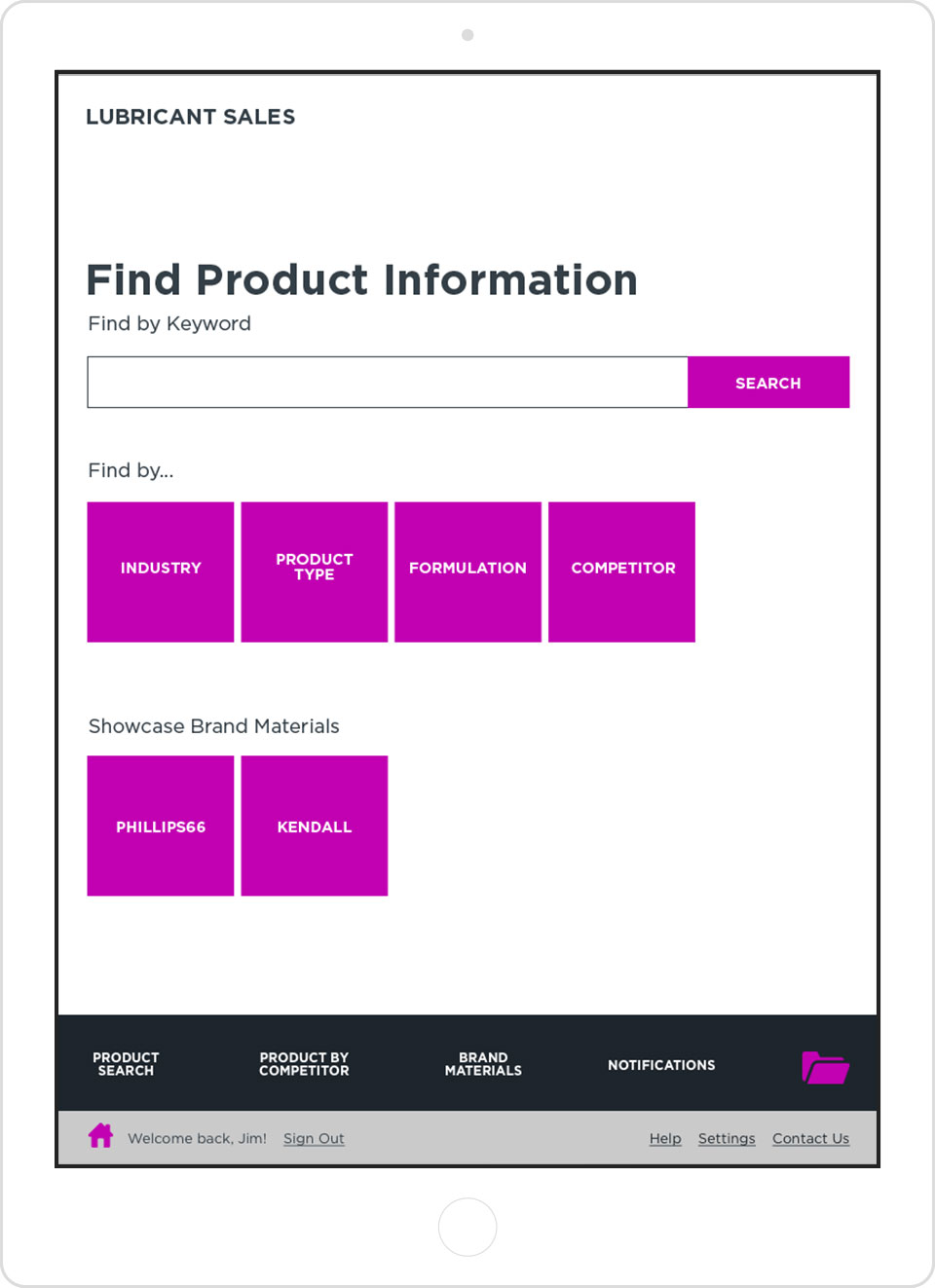
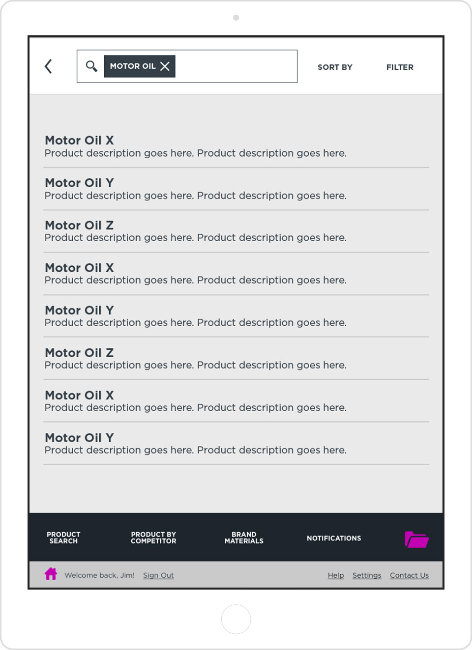
Wireframes
With the screen flows and user research guiding the way, I developed the wireframes for the app. I used InVision to create an interactive prototype of the wireframes.
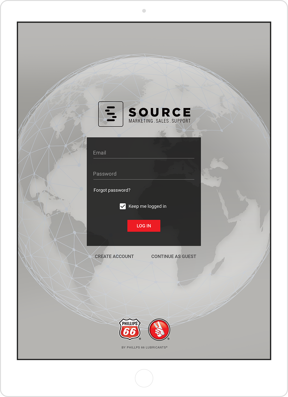
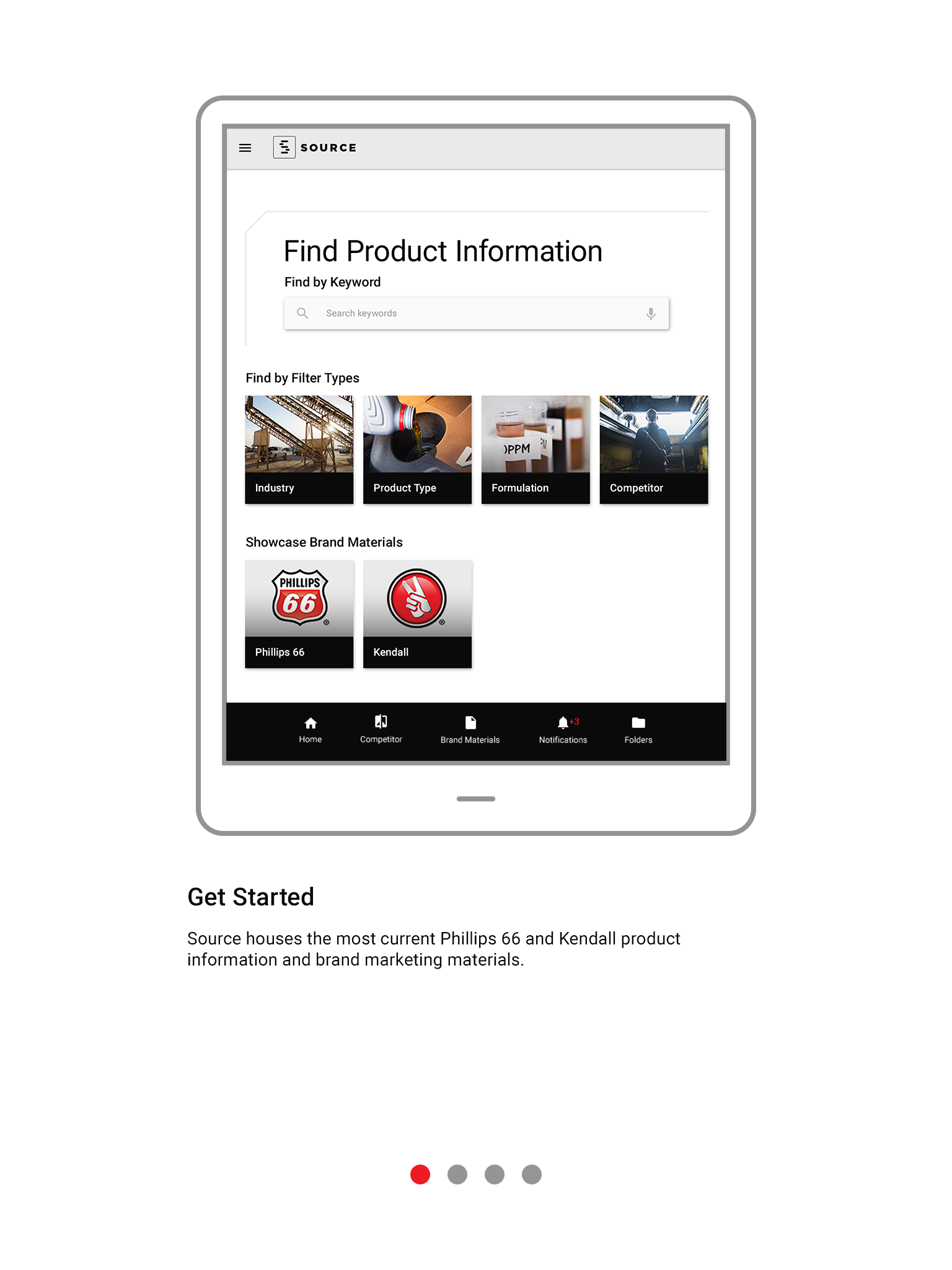
On-Boarding Process
Based on insights from our client, we realized our users might need extra guidance adopting the app. Thus, we gave extra attention to a simple, yet thorough, on-boarding process. First-time users see this simple walk-through when initally opening the app.
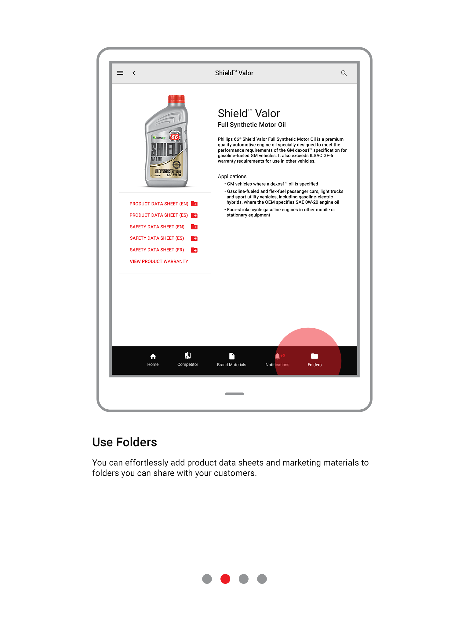
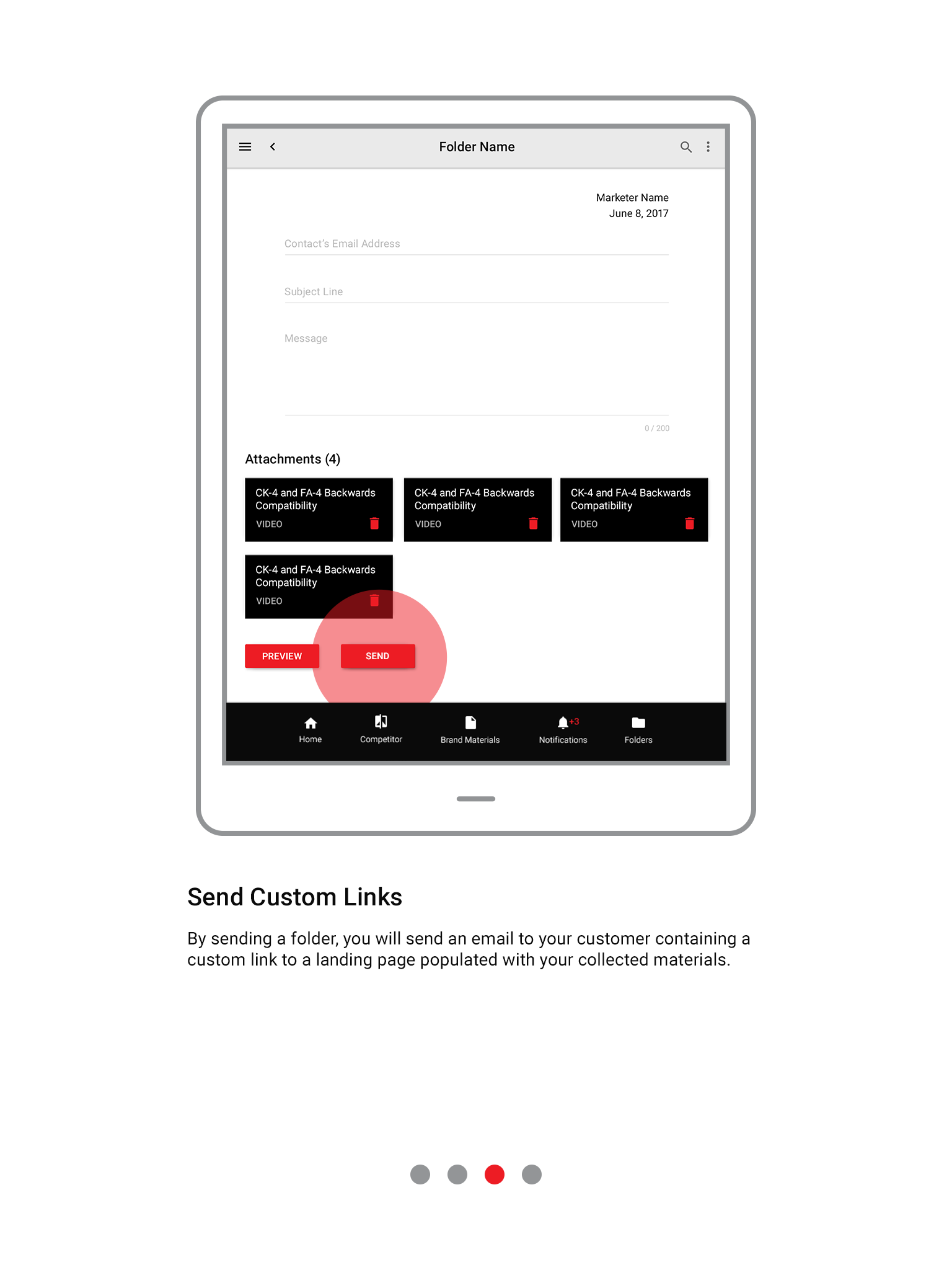
Improving Follow-up
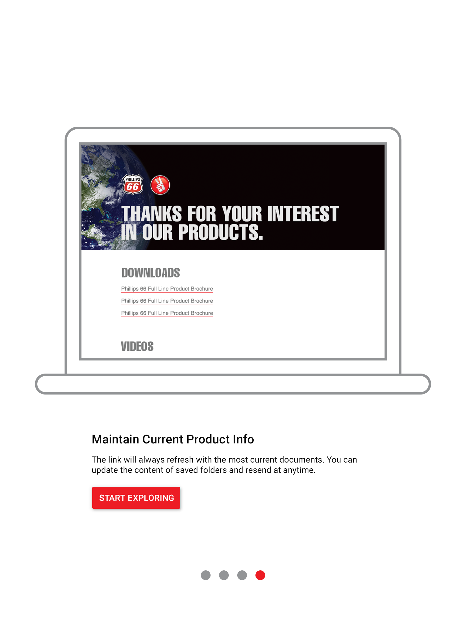
The app allows a user to quickly send an email to his customer. This email contains a link to a customized URL that houses the product information discussed during the sales visit—just a minor improvement over print-outs from a trunk.
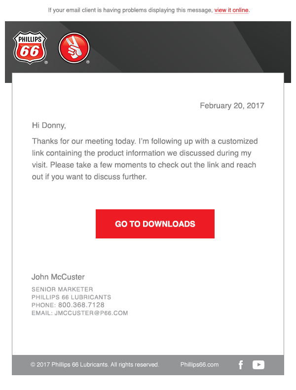
Email Template
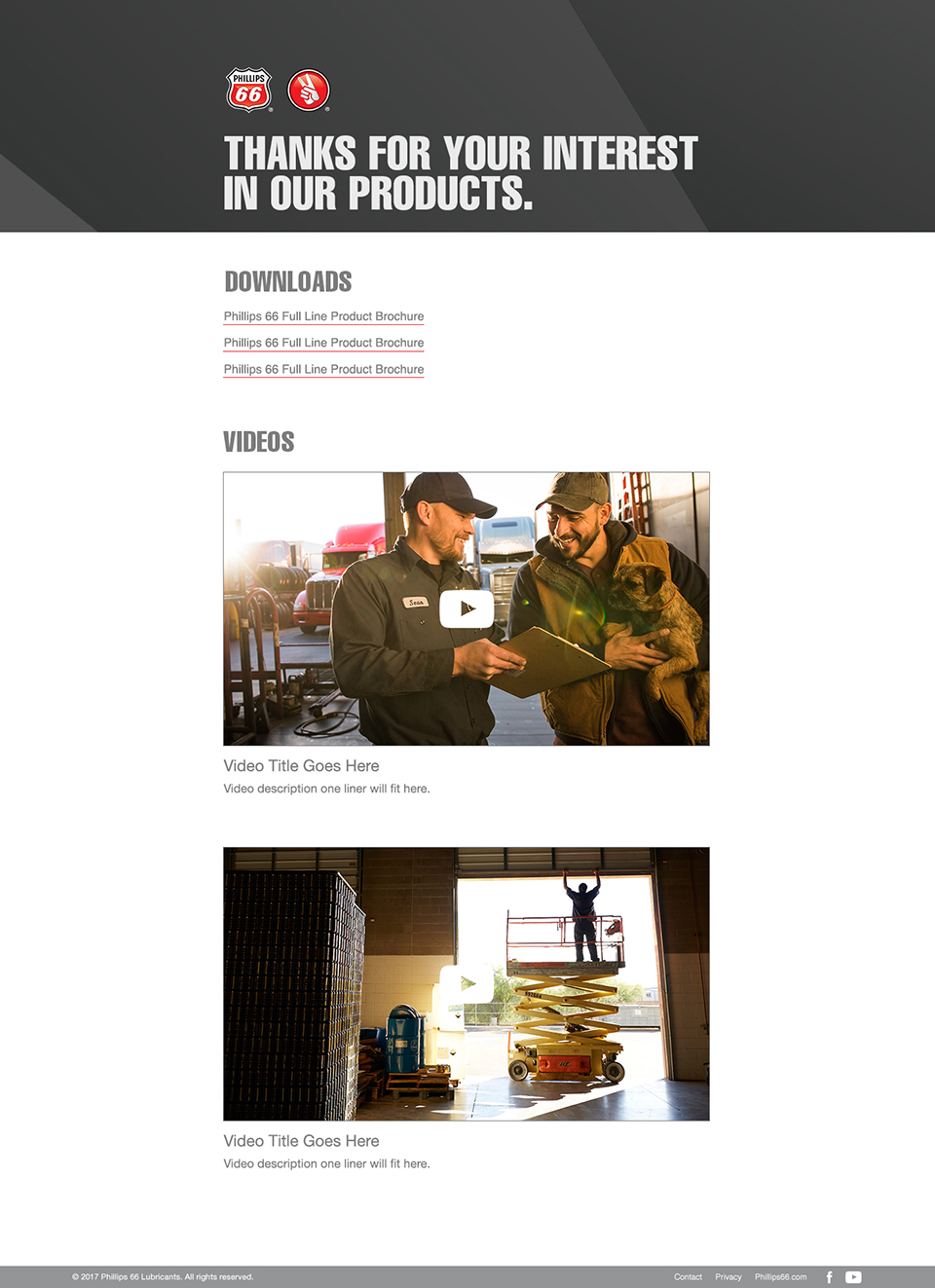
Landing Page Design
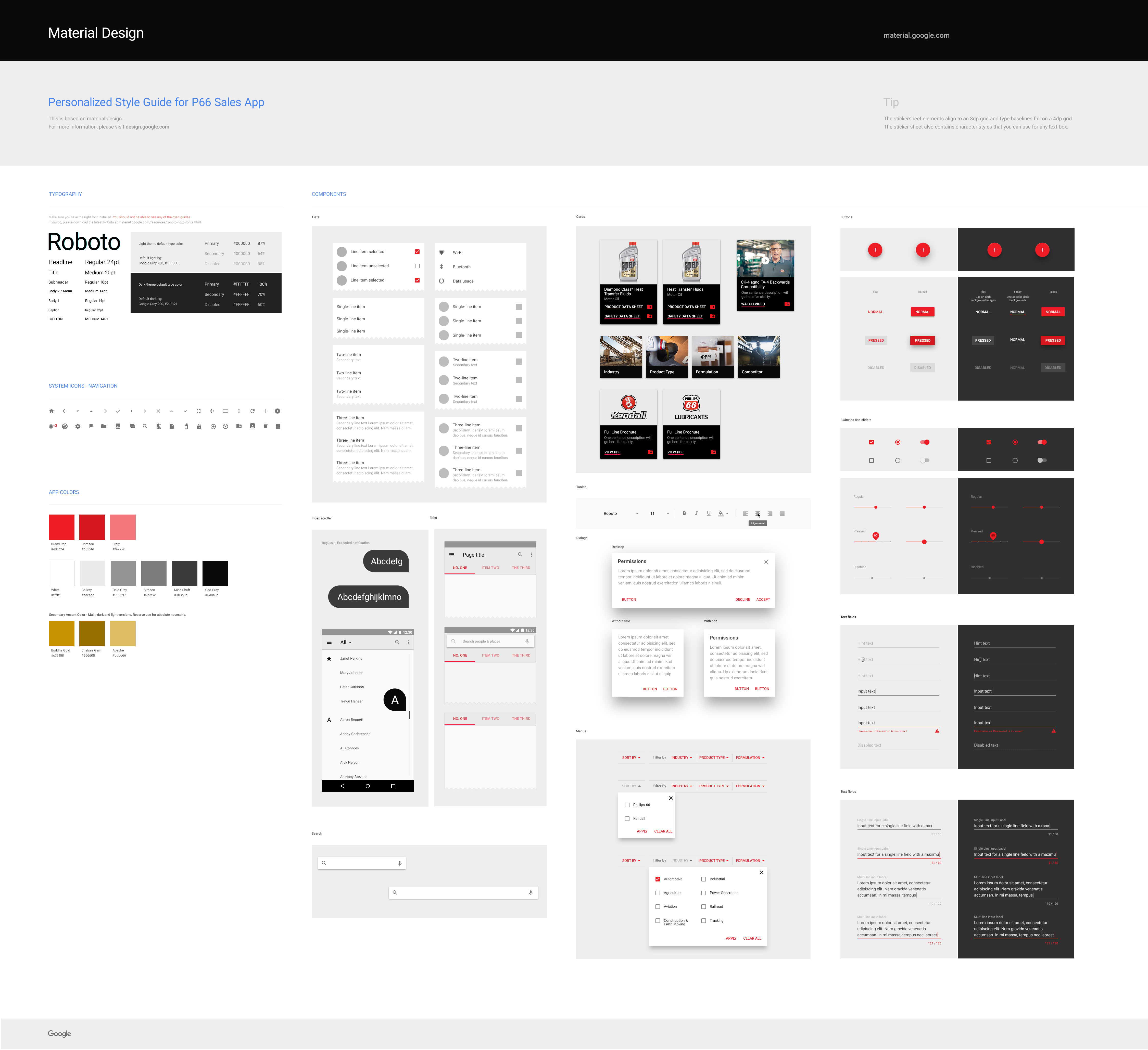
Google Material Design
I based the design of the app on Google Material standards and delivered this customized style guide to our developers. Making this choice at the start of the project allowed us to deliver a high-quality product with faster design and dev times.
Result
The initial version of the app launched the first week of February 2017. There is a plan in place to track: Users, Session Length, Session Interval, Time in App, Acquisition, Screen Flow, Materials Usage. Inviting marketers to test the actual product will allow for user feedback to be implemented in new iterations of the app. In time, we hope to use these analytics to prove app effectiveness over previous sales methods.
Team Credits: Marty Amsler, Creative Director • Brandon Oltman, Branding Art Director • Ariel Sinha, Digital Producer